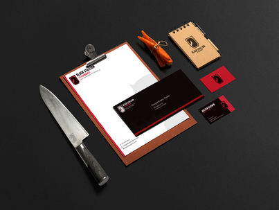

Black Stallion Remake
I have long been excited to start working on a remake of my Black Stallion restaurant brand design.
I wanted to keep to the same concept of a higher-end steak house with some of the characteristic roughness and a strong black and red color scheme. I attempted to tone down the number of small details and unnecessary details in the original design and instead focused on a more universal and varied logo setup. Keeping true to my design professor's concept-pushing philosophy, I wanted to find a healthy merge of concepts (e.g., a black stallion and steakhouse imagery). After a lot of sketching and prototype logos, I couldn't stop loving the current design, a mix of a stallion and a frame shaped like a grill spatula.
I also wanted this brand to be something that I could use to push my branding capabilities and as a premise for designing as much print collateral as possible. While I have experience creating business cards and letterheads, I want to expand my horizons and design print materials that I have done on occasion, or something new for the first time.


